
Build A Production Ready Design System with AI
My 5 step process on how I use Figma Make to easily generate a design system

👋 Hey AI Builders!
Today, I want to share a new episode that just went live on my Youtube channel.

→ Watch on Youtube
Build Your Design System with AI
If you’re building a product without a proper design system, you’ll end up with a messy UI that looks like five different people built it.
I’ve seen it happen too many times.
Someone starts building with AI tools like Cursor or V0, gets excited about how fast things are moving, and three weeks later they’re staring at a codebase where every button looks slightly different and the spacing is all over the place.
The fix?
A design system solves this by establishing rules before you build: these are our colors, this is our spacing scale, these are our component patterns.
The 5-Step Process
Today I’m sharing my exact process for creating a production-ready design system using AI - specifically Figma Make.
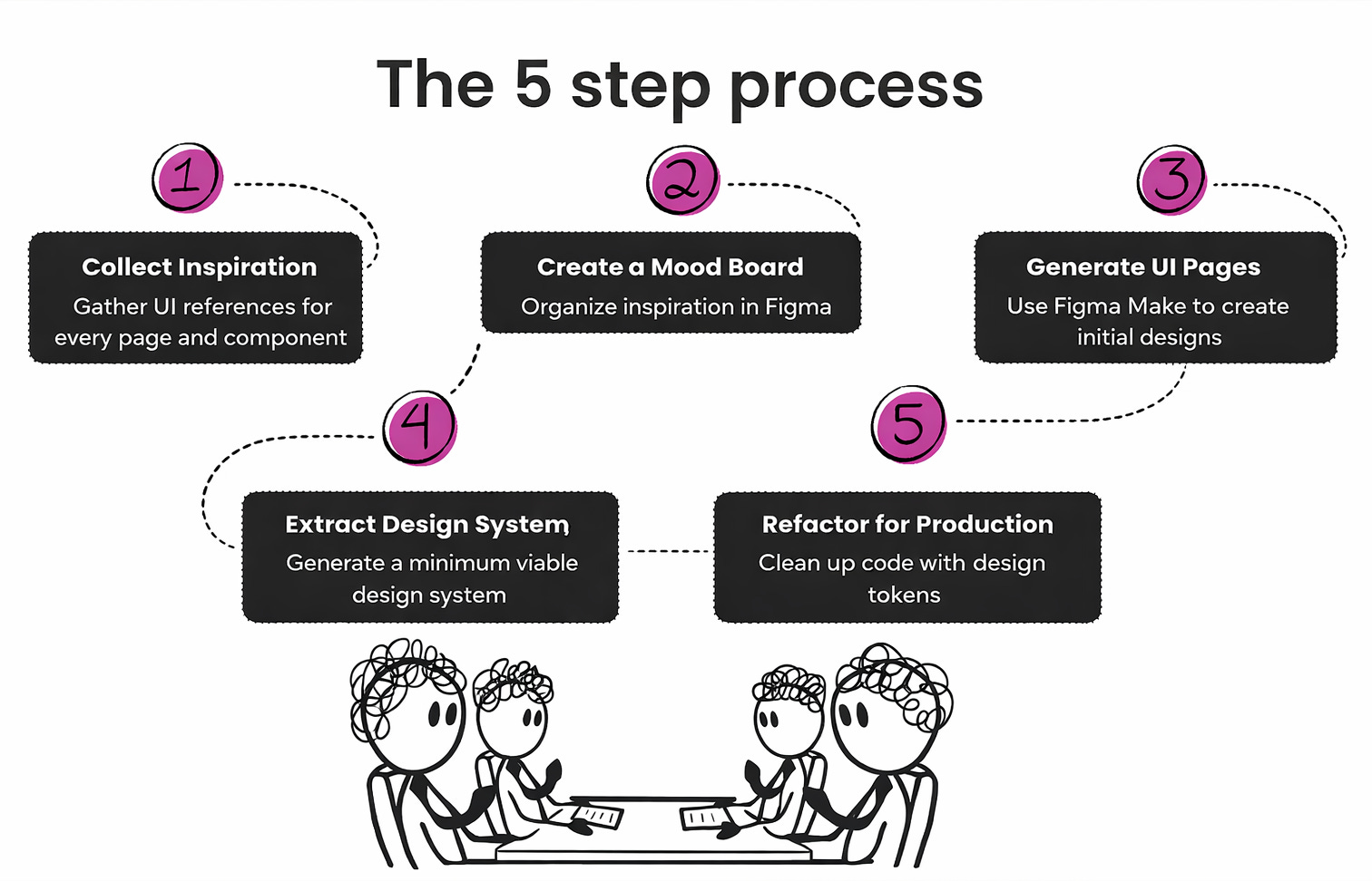
Step 1: Collect Inspiration
Before you design anything, you need references.
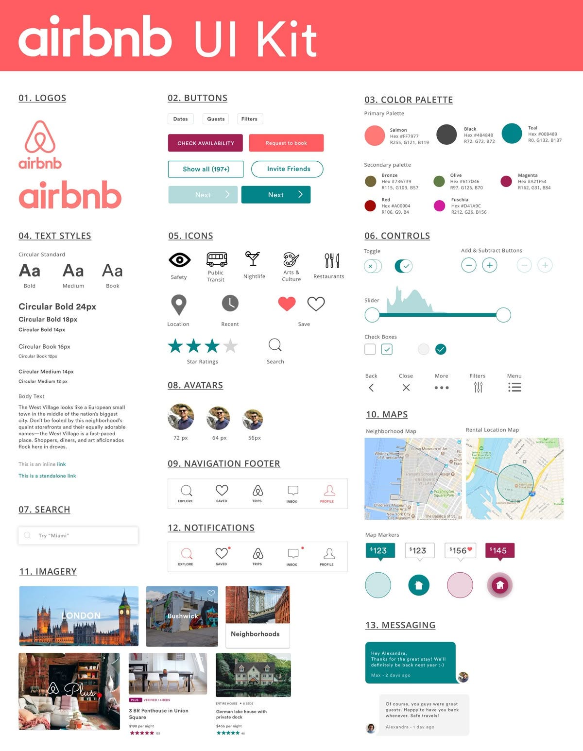
I use Mobbin, it’s a library of real UIs from hundreds of companies.

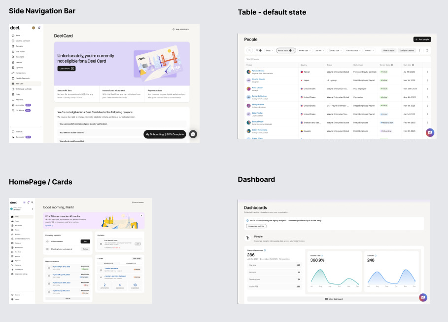
Find a company whose design style you like (Deel, Linear, and Notion are great starting points) and screenshot everything relevant to your product.
What to collect:
Pages — Every unique layout, plus empty states, error states, and loading states.
Components — Buttons (all variants), form inputs, dropdowns, modals, cards, tables, navigation, badges, avatars, alerts.
States — Hover, active, disabled, loading. These matter more than you think.
Step 2: Create a Mood Board
Dump all your screenshots into a Figma and organize them.
Group by category: navigation, pages, components, states. Label everything.
This isn’t just for you it’s also for the AI.
When you send references to Figma Make, organized input leads to better output so you can get pixel perfect replication of your design references.
Step 3: Generate UI with Figma Make
If you haven’t used Figma Make yet, it’s Figma’s AI design tool. Think V0 or Google AI Studio, but integrated directly into Figma.

The process is simple: select a screenshot from your mood board, right-click, send to Figma Make, and prompt “Generate this page.” Review, adjust, repeat.
Start with these pages to capture the most design elements:
Navigation/header (establishes structure)
A table view (captures badges, avatars, status indicators)
A dashboard (cards, metrics, charts)
A form page (inputs, dropdowns, validation states)
Tip: Generate different component states too. How does the table look during bulk edit? How does the form look with validation errors?
Step 4: Extract the Design System
Here’s where the magic happens. Once you have a few generated pages, you can ask Figma Make to extract a design system from them.
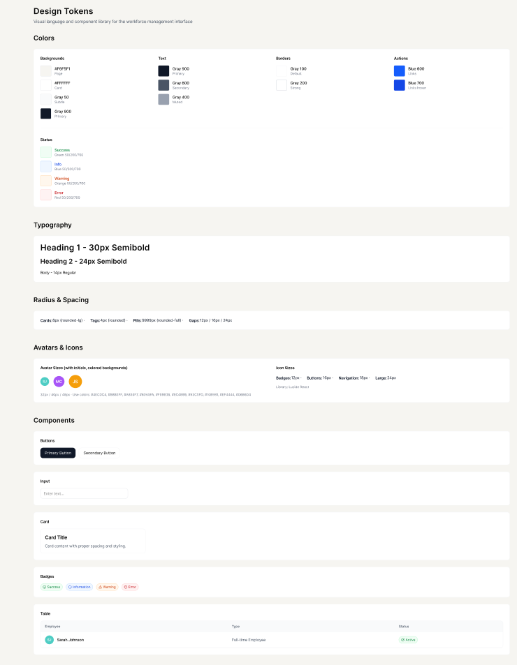
Use this prompt:
Based on the generated UI pages, create a Design System including the following. Should be one page.

Colors
- 3-4 Background colors (page, card, subtle/muted)
- 3 Text colors (primary, secondary, muted/disabled)
- 2 Border colors (default, strong)
- 1-2 Action colors (primary button, link)
- 4 Status colors with bg/border/text each (success, info, warning, error)

Typography
- Heading 1, 2 - size, weight, line-height
- Body, Small/Caption - size, weight, line-height

Spacing & Radius
- Border radius values (cards, tags, pills)
- Gap values (e.g., 12px, 16px, 24px)

Icons
- Library name (e.g., Lucide React, Heroicons)
- Size scale (small, default, large)

Components (1 example each)
- Button (primary + secondary)
- Input (default state)
- Card (basic structure)
- Badge/Tag (all status variants)
- Avatar (with color palette)
- Table (header + 1 row)
One warning: Figma Make might generate something very detailed the first time loading states, empty states, modals, the works. While comprehensive, this can overwhelm AI coding tools like Cursor when you import it, and won't process everything.
Start minimal.
If you need more detail later, split the design system into smaller pages and feed them to Cursor one at a time.
Step 5: Refactor for Production
Figma Make generates code alongside designs. Before using it in production, you need to refactor hardcoded values into design tokens.
Why? Because bg-[#3B82F6] scattered throughout your codebase is a maintenance nightmare. You want bg-primary that references a CSS variable.
Use this prompt in Figma Make:
Audit the entire codebase and refactor all hardcoded design values to use design tokens, following senior UI engineer best practices.

AUDIT SCOPE:
- All component files (UI components, page components, shared components)
- Check for hardcoded: colors, spacing, typography, borders, shadows, radii, breakpoints

REFACTOR CATEGORIES:

1. COLORS - Replace all hardcoded color classes:
   - Background colors → bg-* tokens (bg-card, bg-primary, bg-muted, bg-accent)
   - Text colors → text-* tokens (text-foreground, text-muted-foreground, text-primary)
   - Border colors → border-* tokens (border-border, border-input)
   - State colors → semantic variants (success, info, warning, error, destructive)
   - Arbitrary values like bg-[#HEXCODE] → CSS variables like bg-[var(--custom-name)]

2. SPACING - Replace hardcoded spacing:
   - Arbitrary values like p-[24px] → use spacing scale (p-6, p-4)
   - Gap values → use consistent gap-* tokens
   - Margin/padding → standardize to spacing scale

3. TYPOGRAPHY - Replace hardcoded typography:
   - font-size classes → use typography scale or remove if using semantic HTML
   - font-weight → use design system weights or remove if CSS handles it
   - line-height → standardize or let design system handle it

4. BORDERS - Replace hardcoded border values:
   - border-gray-200 → border-border
   - Arbitrary widths → use standard border-* classes
   - Border radius → use radius tokens (rounded-lg, rounded-md)

5. SHADOWS - Standardize shadows:
   - Arbitrary shadow-[...] → use shadow-sm, shadow-md, shadow-lg
   - Custom shadows → define in CSS variables

6. OPACITY/TRANSPARENCY - Standardize opacity:
   - Arbitrary opacity values → use /90, /80, /70, /60 scale
   - Hover states → consistent patterns

SYSTEMATIC APPROACH:
1. Start with the design system foundation (/styles/globals.css or equivalent)
2. Refactor UI components first (buttons, inputs, cards, etc.)
3. Then refactor page components
4. Then refactor shared/layout components
5. Verify visual design remains 100% identical after each major section

OUTPUT:
- Use fast_apply_tool for all edits
- Work file-by-file systematically
- Group related changes when possible
- Document any intentional exceptions

VALIDATION CHECKLIST:
□ All components use design tokens from CSS variables
□ No hardcoded hex codes except documented exceptions
□ Consistent spacing scale throughout
□ Typography follows system scale
□ Borders use standard tokens
□ Visual design is pixel-perfect identical to before
□ Code is more maintainable and themeable
After refactoring, verify that the visual design is pixel-perfect identical. The UI shouldn’t change, only the code quality.
The Payoff
Once you have a design system in place, everything gets easier:
New pages are consistent by default
AI tools generate better code because they have constraints
Theming becomes trivial (dark mode is just swapping variables)
Your codebase stays maintainable as you scale
The 30 minutes you spend on a design system saves hours of cleanup later.
Resources
Here’s everything mentioned in this post:
Mobbin — UI inspiration library → mobbin.com
Figma Make — AI design generation → figma.com/make/
Cursor — AI-powered IDE → cursor.com